


Rolling with Rowland: Forumula one livery critique (2/22/16)

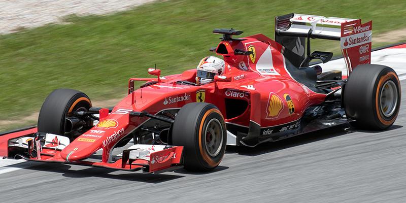
Over the many years of F1, racecar livery has evolved from a simple color to massive collages of spectacular color and busy advertising. Nowadays, racing liveries are determined by the logos of the companies who are willing to pay top dollar. For example the Mercedes car is wearing silver and light blue. The silver is fitting for the silver arrows but the light blue is there because the team’s primary sponsor is the very blue and very wealthy Petronas oil company.
Recently two teams have revealed their official liveries for the 2016 season: Red bull and Renault. Renault was the first to reveal their colors. Renault is going to replace the now defunct Lotus team after struggling for a few seasons. Lotus’s iconic black, gold and red combo is being replaced by the bold Renault black and yellow.
The new livery shouldn’t be described as black and yellow though. It should be described as completely black with a dash of yellow. The only traces of yellow on the car are on the inside of the rear wing and a small part of an aero kit. The car compensates for the dull design by throwing in some matte black patches towards the rear but you can tell that Renault is going for a more simplistic design. To some this new car is very dull and flat but to others it is clean and minimalistic. I personally like the design but I think that they could’ve done a little more to improve the design and I feel like the all black look will wear off throughout the season.
The other livery that has been revealed is the new Red Bull look. They have moved on from their advertising mess of a car onto a cleaner matte look. There is no more giant Infiniti logo and the team has opted against the purple. The new car is also a much darker blue and the bull on the top of the car stands out a lot more than last year. The new design has come under fire for being too boring but I find it to be very refreshing. I no longer feel like i’m watching a mobile times square and I’m not a huge fan of Times square. In my eyes there is only one negative thing about the new livery and that is the matte paint. The entire car is matte and I just feel like it would look 10x better if they had stuck to a traditional glossy paint.


MacAlister Livingston • Dec 15, 2017 at 12:21 pm
I love the new livery! the only thing is the rear disffusers look horrible…. But the livery looks clean and fresh….. I like the new cars with the matte liveries